Years
ago when stencilling was all the rage in interior design, I used this technique
to add a touch of individuality to rooms such as my daughter’s which featured a
two colour wall incorporating stencilled suns and stars.
 |
| Decorative stencilled design |
Painstaking
to create as each image has to be carefully transcribed into position using
special stencilling crayons, stencilled designs are too fiddly and time
consuming for today’s fast paced life where everyone wants that instant
designer look with minimal effort. So it
is with heavy heart that I am now covering these with emulsion.
Being
a Starbucks ‘coficionado’, my daughter has gone for a paint colour called Mellow
Mocha to create a more neutral colour palate in her current two shade boudoir. This rich taupe/beige should
give the room a warm feel and contrast nicely with white woodwork and coving.
 |
| A lovely shade of sludgy grey pink or taupe |
Now
before you all go scrambling for your keyboards to pen a concisely worded email
to Dulux regarding their use of the term ‘Mocha’ to describe a colour that
closely resembles a sludgy grey pink more than your favourite Mochachino then a
word here about paint colours.
Firstly,
the fancy monikers paint companies ascribe to their emulsions cannot be used in
a court of law to accurately verify a specific shade of colour that may or may
not be contained within a can. These descriptive
names are purely concocted for marketing purposes as someone is more likely to
buy a can of aptly named ‘Café Au Lait’ than ‘Donkey Droppings’ when looking
for a shade of brown.
Secondly,
colour and how it appears on a wall or other surface can be affected by many
factors such as lighting (natural or artificial), room size, perspective (where
you are stood in relation to what you are looking at) and even your own
eyesight. How many of us can boast to
having 20-20 vision? Mine is definitely more
Mr Magoo as time goes on.
A
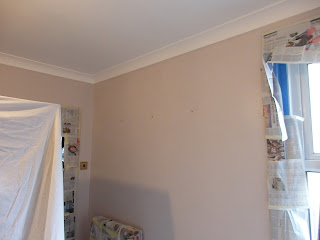
couple of coats of Mellow Mocha later and the same room looks like a completely
different one.
 |
| Before Mellow Mocha paint job |
 |
| After - Subtle colour that contrasts well with white |
 |
| Painted wallpaper also looks good in this colour |
 |
| Will make a nice base colour for accessories such as prints |
And
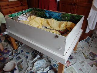
because I’m a ‘saddo’ even Shelby’s tortoise table is getting the Deco makeover
in Mellow Mocha.
 |
| Tarting up the tortoise table |


